Charlotte, Rebecca and Clark
Thursday, 15 December 2011
Wednesday, 14 December 2011
Evaluation questions by Charlotte Alderson
question 1
analysing the trailer:
analysing the posters and the magazine:
question 2
question 3
for this question we needed to get audience feedback. i not only did a video showing peoples immediate feedback but i also put it on face book to get some of my friends opinions. as i worked in a group becky put the trailer up on face book and clark put the magazine up so i put both posters up. i also gave a few people a questionnaire to get their written feedback. i thought a mix of feedback would be the best to get results.
so what have i learnt from my audience feedback? there has been both positive feedback and constructive critiscm back. every one liked the three products and many people mentioned they like the music, the intertitles and the credits. they mentioned certain shots they liked also, such as the night vision shot and some others. zoe mentioned in her questionnaire that there was no continutity of costumes but that was what we wanted; we wanted to show that this was a prolonged horror and that the clown didnt leave them alone so we actually made it a task to change outfits. the trailer got good feedback with people mentioning "professional" looking elements such as the beginning and ending credits, the logo, the intertitles and the ending title. the slow shot of the main character and the clown staring at each other was a popular one. a few people mentioned that a few more characters would have been nice, which was our original intention and i do agree with them but unfortunately we didnt get any more than three. throughout feedback, including facebook, questionnaires, videos and through talking to people, everyone agreed with the idea and thought the clown was scary. the majority of people i talked to and got feedback from thought the best product was the single clown poster as they thought it was simplicitic and effective, however there was still something to improve as i could have made his nose more red to make it fit better with the three colour palette rule. i wanted to get some statistical data too to make it more interested and they all rated the products very highly. people thought the magazine was also good showing good continuity with the other products, however some felt that it could have been more symmetrical and could have filled some spaces up. overall i have felt that doing this audience feedback has been very beneficial and it has highlighted things i could have improved and things that i did that people liked.
question 4
all questions by charlotte alderson
analysing the trailer:
analysing the posters and the magazine:
question 2
Question 2 on Prezi
question 3
for this question we needed to get audience feedback. i not only did a video showing peoples immediate feedback but i also put it on face book to get some of my friends opinions. as i worked in a group becky put the trailer up on face book and clark put the magazine up so i put both posters up. i also gave a few people a questionnaire to get their written feedback. i thought a mix of feedback would be the best to get results.
so what have i learnt from my audience feedback? there has been both positive feedback and constructive critiscm back. every one liked the three products and many people mentioned they like the music, the intertitles and the credits. they mentioned certain shots they liked also, such as the night vision shot and some others. zoe mentioned in her questionnaire that there was no continutity of costumes but that was what we wanted; we wanted to show that this was a prolonged horror and that the clown didnt leave them alone so we actually made it a task to change outfits. the trailer got good feedback with people mentioning "professional" looking elements such as the beginning and ending credits, the logo, the intertitles and the ending title. the slow shot of the main character and the clown staring at each other was a popular one. a few people mentioned that a few more characters would have been nice, which was our original intention and i do agree with them but unfortunately we didnt get any more than three. throughout feedback, including facebook, questionnaires, videos and through talking to people, everyone agreed with the idea and thought the clown was scary. the majority of people i talked to and got feedback from thought the best product was the single clown poster as they thought it was simplicitic and effective, however there was still something to improve as i could have made his nose more red to make it fit better with the three colour palette rule. i wanted to get some statistical data too to make it more interested and they all rated the products very highly. people thought the magazine was also good showing good continuity with the other products, however some felt that it could have been more symmetrical and could have filled some spaces up. overall i have felt that doing this audience feedback has been very beneficial and it has highlighted things i could have improved and things that i did that people liked.
question 4
all questions by charlotte alderson
Friday, 9 December 2011
Evaluation Question 4
How did you use new media technologies in the construction and research, planning and evaluation stages?
by Rebecca and Clark
Thursday, 8 December 2011
Tuesday, 22 November 2011
Evaluation Question 1
In what ways does your media product use, develop or challenge forms and conventions of real media products ?
by Rebecca Hart
To begin answering this question, I am going to take different shots from my trailer and analyse and annotate them, and assess how well they reflect the forms and conventions of the horror genre.

by Rebecca Hart
To begin answering this question, I am going to take different shots from my trailer and analyse and annotate them, and assess how well they reflect the forms and conventions of the horror genre.

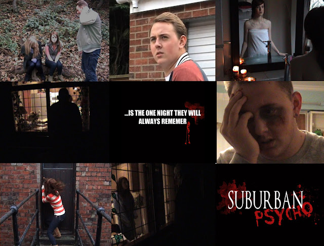
The first clip I have chosen from my trailer establishes the storyline of the rest of the trailer/film. It is fairly typical of horror films; a group of teenagers are alone in the woods and one of their friends have gone missing, and I personally believe that this initial part of the sequence establishes the story quite well. There are shots of the characters looking worried and upster, with another character then coming into the frame saying "I can't find him anywhere..." This sets up the basis for the rest of the trailer, which follows on and is quite self explanitory. This introduction to a film trailer is very typical of a horror film trailer, with our group noticing in particular the first scene of the "I Know What You Did Last Summer" film trailer.
The second clip introduces the characters individually to the audience. Again, we know this technique is typical of horror film trailers as we noticed it in the trailer for "Scream 4", and it was a technique that we thought was extremely effective. The clips are kept very short, and fade in and out, showing the characters in their everyday surroundings going about their everyday business, with their purpose being to introduce the characters to the audience, and almost make them feel a connection to them, therefore making them slightly worry for safety and well being, which is most likely in danger due to the nature of the film. This grips the audience, and is a convention that is very well and commonly used in professional texts.
The purpose of the third clip is to step the pace of the sequence up a notch. It is at this point that the action of the trailer begins, with the characters becoming suspicious that something unusual is going on, which is a technique used in many horror film trailers.
The fourth shot establishes the creepy plot of the whole trailer, with the ominous black silhouette against the kitchen window working very well to do this. The thought of somebody being outside watching you in your own home is a thought that could scare anybody, and works well in creeping out the audience, as it is a universal fear.
Our intertitles, shown in the fifth shot, are designed to fit with the rest of the trailer, and give off the same scary vibe.
Wednesday, 16 November 2011
Rough Cut Poster, Magazine and Trailer
Here is the rough cut posters, magazine and film trailer, which we are going to put onto Facebook and invite our peers to review them. This is very important as this is our target audience, and they can give us very important advice on how we can improve our products so that they have the most appeal.
by Rebecca Hart
Tuesday, 15 November 2011
Change of title font
Whilst we were in the process of creating our products, we began to feel that our title fonts was a big weakness and that it could be improved in order to make it look much more professional. I began experimenting with different fonts, particularly after comparing our poster with the professional text poster for 'Last House on the Left', a poster which follows a similar colour theme to our own. I noticed that the font used in this poster was much more simple, making it look much more effective. Here is my own rough draft of a new possible title to feature in the trailer, poster and magazine, shown in comparison to the old copy, and the poster for last house on the left.
I personally think this new font looks much better, and is more suited to a horror film poster, unlike the old one. I think the old font and layout looked very unprofessional, and had connotations of an old cheesy 80's horror film and didn't really give the audience any sense of fear at all due to the very bold and 'in your face' font, rather than an understated and simple font, which tends to be much more modern and scary.
by Rebecca Hart
Initial Magazine Cover and Posters
Here is our initial magazine cover and poster. I am quite happy with what we have produced; I like the general layout, images, colour theme etc, however I feel like the title and the title fonts really weaken our products drastically. I think it looks quite unprofessional, and doesn't convey the right message about the film. I don't think this current title looks scary or sinister enough, so I am going to re-evaluate, do some further research, and attempt to re create our film title image. Other than that though, I am happy with these two products so far, and once I have made the changes we will get some initial audience feedback over facebook.
Wednesday, 9 November 2011
new credit block
old credit block:
the new credit block:
i made a new credit block as i thought this text and different effects made it look more professional.
by charlotte alderson
the new credit block:
i made a new credit block as i thought this text and different effects made it look more professional.
by charlotte alderson
Thursday, 3 November 2011
filming for our trailer and taking photographs
these are the photographs we took the first day we filmed;
these are the photos we took of when we were shooting some photographs in the studio;
by charlotte alderson
these are the photos we took of when we were shooting some photographs in the studio;
by charlotte alderson
photoshoot
we all started to take some photos in the studio and these are a selection of the ones we took:
i then took some of these photographs and made changed them slightly to look more professional.
by charlotte alderson
i then took some of these photographs and made changed them slightly to look more professional.
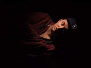
i made the face brighter and the contrast stornger so the background looked darker with deeper shadows.
i did the same for this photo, i wanted it to be brighter as i thought the original was too dark. yet i still wanted the background to be very dark so it looked like the clown was coming from the dark.
this photo i moved the clown and i closer and made the lighting different.
i moved clark more centred in the photo and changed the contrast slightly.
i changed this photo by moving the characters closer together, changing the brightness, contrast and altered the curves of the photograph. i thought this made the photograph look more professional and effective
by charlotte alderson
Tuesday, 25 October 2011
Friday, 21 October 2011
ending credits
these are the ending credits that i made for the trailer. these will go at the end and will make the trailer look more authentic and professional. i chose a font that is suitable for the credits with narrow and tall letters. i also made some of the word smaller in the style of a professional one. i also made it embossed and gave it a colour gradient to make it look like professional practice.
by charlotte alderson
Weather Forecast for Filming Days
 Because we scheduled to film the majority of location shots on Wednesday 26th October, I checked the weather forecast out online to check that the weather would be okay, it is forecasted cloud and sunshine, which means we can get the majority of our filming done without any weather problems. -Clark Warburton
Inter title Research
This is an inter title from the film 'Creep'. The film is about a monster creature living in the underground in London. The producers have followed this theme by creating the background to look like a map of the underground, and the text slowly moving across the screen. It looks really good and it gives and element of continuity throughout all of the products.
This is an inter title from 'Saw', and is also animated. As it is a 3D film, the inter titles are designed to fit with this, so it features a trap coming out and snapping around the text.
This is an inter title from 'Scream 4', which features a shadowy silhouette of the famous scream mask floating around in the background, with the text fading on screen.
After looking at all of these inter titles from professional texts, I can see that the majority of inter titles are usually animated, with some kind of imagery in the background. I will go back and develop our inter titles to make them resemble professional texts much further, by animating and adding background imagery.
Thursday, 20 October 2011
Intertitles
Whilst we are still in the process of filming our trailer, we have been using our time by creating different parts for the trailer, so that it makes the editing process much easier. Here are some of the inter titles I have created which will be inserted into the trailer. They use the same black, white and red colour theme as the title, so that it still has continuity. We may animate each of the inter titles as to how they appear on the screen, possibly using a type writer style effect.
by Rebecca Hart
Subscribe to:
Comments (Atom)


